
Numbers are boring, people are interesting.
One of the most dynamic projects our content team ever worked on could’ve easily been one of our most drab: A report on digital marketing trends.
Mountains of data had been collected and analyzed. The trick was to find the story buried underneath it all—and to tell that story through statistics, visuals, and narrative.
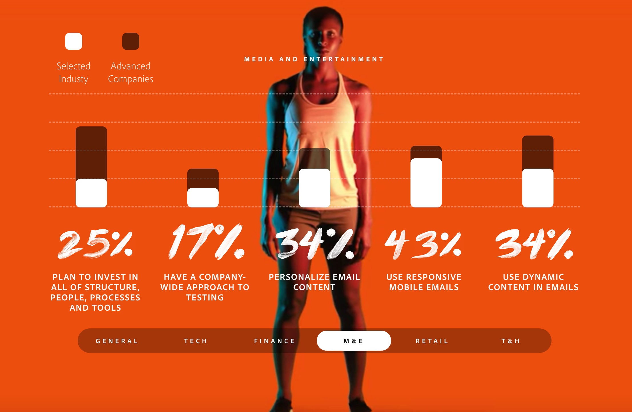
To do it, we created a surprising-but-apt “runner’s high” theme, sliced and diced the data for a variety of audiences, wove in stories and insights from industry experts, and worked with our friends at Thinkingbox to transform the complex data into an interactive experience. (You can check out the work here.) Together, this brought deeper meaning to the metrics—and made exploring them a whole lot of fun.
Not too shabby for a project that started as a pile of data in an Excel spreadsheet.
I’d love to see this done more often in corporate sustainability content. With the volumes of reporting data and metrics collected each year, there’s a huge opportunity to bring data storytelling to everything from impact reports to infographics, and from web content to videos. Perhaps that’s what prompted the UN to put out its Practical Guide to Data Storytelling in Voluntary National Reviews and SDG Reporting, which offers in-depth strategies and examples to help sustainability professionals construct effective data stories.
Data delivers the what, stories deliver the why.
When sharing data with an audience, your first job is to make it easy for people to understand. This starts by presenting the patterns and trends in a way that’s simple, clear, and relatable. But you shouldn’t stop there. That’s because, as NYU professor and social psychologist Jonathan Haidt puts it, “the human mind is a story processor, not a logic processor.”
By adding insights and stories that show the people behind the numbers, you can light up the emotional parts of your audience’s brain as well as the rational parts. And when you tap into their emotion, you have the power to influence how they think and the actions they take.
Once you start seeing your data as more than a set of numbers to push out, you’ll find storytelling potential everywhere. Here are a few tips to get you started:
- Cater to your audience—Start at the same place all content projects start: Understanding your audience’s needs and challenges. What in your data matters most to them? And what’s the best way to make the information clear and understandable, based on their level of data literacy and their knowledge of the topic?
- Storyboard your data—Use sticky notes or a whiteboard to organize your data points into a story with a beginning, middle, and end. This can help you determine what data’s essential, what’s less important, and what gaps you still need to fill. And be willing to kill your darlings. You’ll likely have to cut some things in order to tell an effective data story.
- Find your aha! moment—Pinpoint the climax of your data story, which should center around your greatest insight. It’s what data storytelling expert Brent Dykes calls the aha! moment. Once you’ve identified this key insight, arrange your storyboard so that all data points lead up to the big aha!
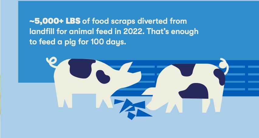
- Use meaningful equivalents for large numbers—Think back to job one: Making data easy to understand. It’s hard to conceptualize millions, billions, and trillions. You can help your audience grasp this kind of magnitude by putting numbers in the context of more relatable units. For our clients at Tillamook, we equated recycled food scraps to pigs eating ice cream cones for 100 days.
- Show the lives behind the numbers—Statistician Hans Rosling often said that “numbers are boring, but people are interesting.” He spent his entire career in the world of facts and numbers, even writing a book, Factfulness, on “the stress-reducing habit of only carrying opinions for which you have strong supporting facts.” But he also argued that data needs a human story. We must illustrate the impact that facts have on real human lives.There are many ways to do this, but it can often just be a tweak in how a stat is presented. For example, rather than touting the amount of money invested into a program, show the number of people who benefitted from it.
Contrary to popular belief, the numbers don’t speak for themselves. It’s up to us to give them a voice and make sure they’re heard.
Our Most Recent Insights.
SEE ALL INSIGHTS →
Storytelling
How to get more people to care.
Aha! moments from our most recent sustainability communications workshop.

Storytelling
A future that’s better than break even.
Lessons from a sustainability pioneer on hope, impact, and action.

Storytelling
Communicating without polarizing.
Protect your messages against cultural and political pendulum swings.